 Skip to content
 1. Having a Multi-Step Process
If you require donors to go through a multi-step process, require them to create a username and password, or fill out lengthy forms before they actually get to make a donation, impulse donors who are inspired to give by something they read or saw, will quickly lose that fleeting inspiration and drop out of the process.
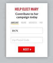
The donation process should be as simple as possible: click to donate, fill out the form on one page, and click to submit. That’s it!
Try this tip: Twice a year, try making a donation on your own website to evaluate the process. When you do, imagine that each step gives donors one more opportunity to drop out. It’s like you’re saying: Do you want to donate? Are you sure? Are you really sure? Are you really, really sure? Are you really, really, really sure?
2. Using a Complicated Form With Too Many Fields
Good donation pages just ask for the essentials information needed to process a donation – name, mailing address, and credit card information.
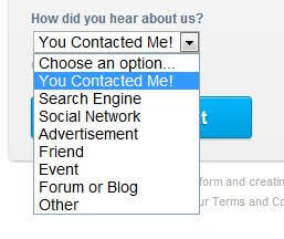
If you are overloading your donation page with tons of additional fields, donors will get frustrated and abandon the process altogether.
If you really want to collect additional information about your donors, don’t do it on the donation page. Instead, redirect donors to a page where they can voluntarily enter further information after the donation has been completed.
3. Using a Form That Looks Completely Different From Your Website
There’s no quicker way to lose donations then by taking donors to a third party site that looks nothing like the rest of your website.
Donors will start to question where they are, whether it’s legit, whether it’s secure. In many cases they abandon the process.
PayPal, for example, is the choice for lots of nonprofits who want a donation page up fast, but have you considered how it impacts the donor experience and conversion rate?
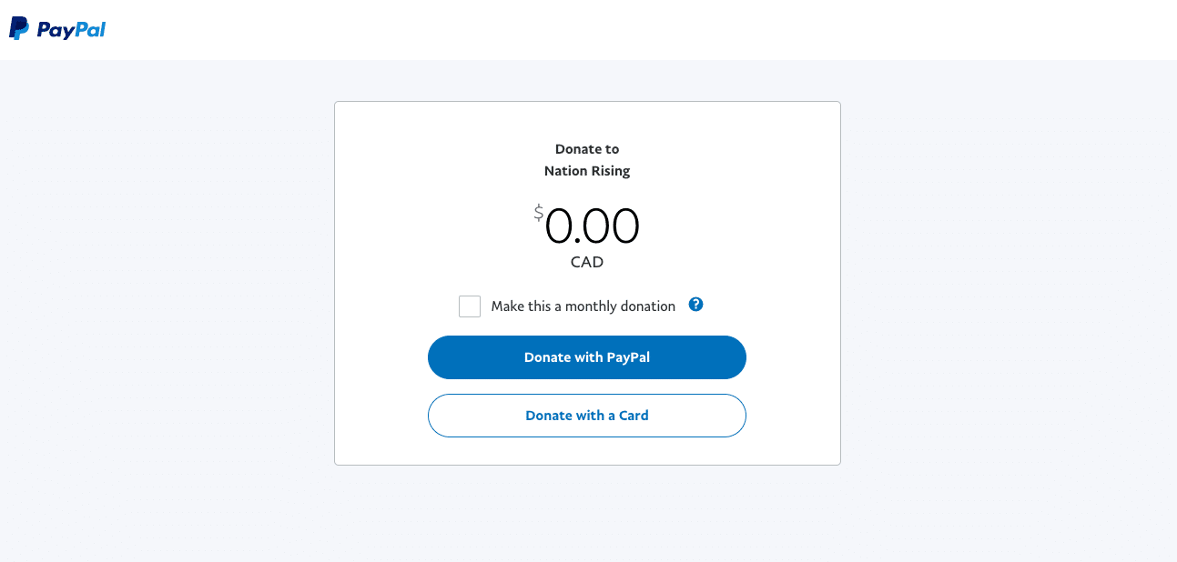
We explore this in greater details in this post about PayPal Donate Button Vs. Integrated Donation Forms.
It’s really important to make the donation process as seamless as possible, and having a donation page that matches the look and feel of your website like Sumac’s embedded donation forms is a huge part of this.
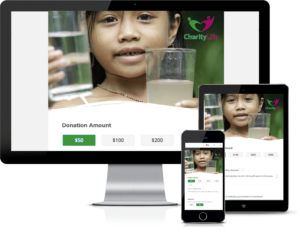
4. Not Including Suggested Giving Amounts
Ok, this one is not an absolute deal breaker, but offering suggested giving amounts removes some of the guesswork, making it that much easier for donors to give.
It’s a good idea to use your average gift as a starting point, and then offer one giving amount that’s slightly lower and two or three higher amounts.
5. Not Having a Recurring Gift Option
This one is also not a deal breaker, but you are greatly limiting your fundraising potential and doing yourself a huge disservice if you are not offering a monthly donation option.
Do the math yourself using our monthly giving calculators.
In fact, if it’s not an option on your donation form, you should change this today! Just imagine one donation of $50 turned into a monthly donation that could last 5-10 years. Suddenly, $50 just became $3,000 – $6,000!
.png)